Tuesday, February 26, 2008

Blog Entry Assignment #2


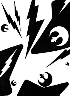
This is my final part III to our first assignment which mostly centered around using dominance to make an interesting and eye-catching composition. The first part we were to use a circle, line, and rectangle. The second part consisted of using those 3 basic shapes again, but using 5 of one, 3 of another, and 1 of the lest shape. The final part of the project was to make a composition of the same type, using 7, 5, and 3, of the shapes. We also had to chose 3 shapes, one rectangular, one linear, and one circular, which all described us personally. I chose the body shape of a Gibson X-Plorer guitar as my rectangle, the Rebellion logo from Star Wars as my circle, and a lightning bolt (which represents comics because of how many super heroes have lightning bolts in their logo/uniform) as my line. I tried to use the rectangular shapes as my dominant positive spaces because they have the least detail, so I arranged them around the page, trying to space them out. Next I tried to mix the lightning bolts and rebellion logos as my accentual and subordinate shapes to have a little variety. Other than that, my main focus was to arrange the objects in a way that moved the eye around the page from the top left corner then down and to the right and then back again in an L motion.

Image Essay #5


Alright, here is one more work by Armin Mersmann and since I think I’m overusing this artist a little, this will be the last work of his I used for these image essays. Anyway, I really like this piece because of how simple the subject matter is. It’s just a small patch of ground with grass, dirt, pebbles, etc. and he turned it into a very interesting piece of art. I like it also because it looks very abstract but it’s almost like a natural abstractness. Also this is another great example of the great detail and textures he can recreate with just a pencil and paper and using different shading and line types. Mainly the thing I like most about this picture is the fact that it really makes the viewer rethink how they see the world. Personally, pieces like this cause me too look way more closely at everything around me.

Image Essay #4


This is another work by Armin Mersmann. I chose this work because I just love the theme. He said his main inspirations for this work were the Holocaust and the current events happening in Iraq. I like how he uses the crow and skulls as a sort of main tool in communicating the overall message of the piece. They’re very simple and obvious objects used to symbolize death but they aren’t overpowering and don’t make the whole picture seem cliché. Also I like how the eye on the left is looking the viewer right in the face in a sort of accusatory way and gives the viewer a feeling of guilt, and how conversely the eye on the right is looking off in the distance as if hopeful for better things to come. The roots however, baffle me. I just can’t seem to figure out their meaning and how they contribute to the message, but even though I don’t know the reason behind them I like how they look and that they help to draw my eyes into this piece and keep me looking at it. I chose to examine this piece because of the way he used different line types and ways of shading and such to turn a regular pencil and paper drawing into something as detailed as a photograph. Also I like that this picture has depth to it due to the perspective used on tops of the roots moving off into the distance.

Image Essay #3


This is a drawing by an artist named Armin Mersmann. It was first titled Jessica but was renamed The Waking Edge. I love this drawing and all of his others because I’m blown away with how well he can recreate texture and detail with just a pencil and nothing else. This picture, for example, is just graphite on illustration board. Personally, having used graphite pencils for about 5 years, I find it extremely impressive that he can make such fine detail the way he does in all of his work. I chose to examine this work because of its definitive qualities with the level of contrast over the whole picture and also shadowing in the bottom left corner. Furthermore I thought this was a prime example of how to create texture and detail with just different types of pencil strokes and line qualities. Specific examples of this that I notice as a reoccurring quality in all of his work is the extreme detail with each and every strand of hair and every single thread of fabric in the girl’s sweater.

Image Essay #2


This digital painting is entitled World Museum and it was made by Gary Tonge (handle: Antifan-Real), an artist that I watch pretty closely on deviantART because I really like the style with which he makes his works. This was a painting he did in only an hour, which is pretty fast because most of his more complicated works are done in 20 hours on average. Anyway, I like this picture because of the rough sketchy nature of the painting and I like how well it expresses dominance. The enormous red globe is obviously the dominant structure with the background windows as subordinate structures and the people in the middle ground as the accentual structures. Also I like the extreme highlights which give it a high contrast feel and add to the definition of the overall piece. I chose this work over some of his others because I thought it was a pretty basic example of dominance.

Image Essay #1


This photograph is entitled -148- and it was taken by an artist I found on deviantART.com (where I find most of my favorite artists) who calls himself 'rainris'. I really like this picture foremost because it reminds me of something that looks just like a movie still taken from some long lost Alfred Hitchcock film or something. It's more than just a picture, it has a story in it, and I like when you can tell a story with one picture. But I also really like the composition in this picture because it does a good job of using the blackness in the tunnel to even out the negative and positive space without making the picture weigh too much to the left or the right. Also the man in the front has alot of dominance over the couple in the back. I like how the photographer not only used size to accomplish this but how he also used clarity by focusing on the man in front so the couple is extremely blurry.